The growing importance of estate agent websites
For many years, when thinking of moving, our first reaction has been to get onto the portals. Whether Rightmove, Zoopla, OnTheMarket (or other new players entering the stage), we have searched for our next home without perhaps even considering a quick peek at what is available on an estate agent’s website. However, is the momentum starting to shift away from the portals?
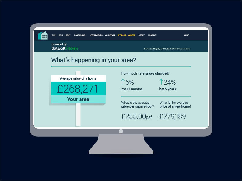
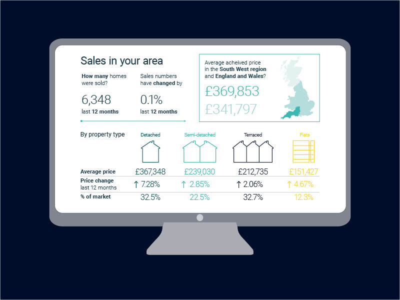
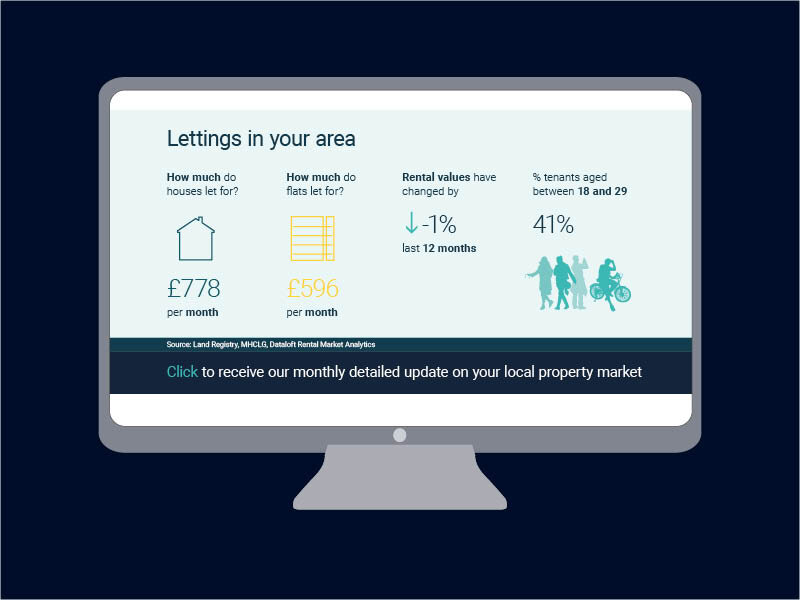
Estate Apps have certainly seen a major change in the last year: “In general Estate Apps have seen 40% more activity on their agents’ websites during the last year than before so agent’s websites are busier than ever”. At Dataloft, we have also seen some remarkable activity on the local market insight pages that we feed through from our online platform, Dataloft Inform to agent websites, with over 2 million hits in recent months. This means that people are not only visiting an agent’s website but also spending time engaging with the content, signifying genuine interest in making a move and appointing an agent.
When we analysed the Property Academy Home Moving Trends Survey in 2020, we also found that almost double the number of tenants found their next property on an agent’s website compared to the year before.
And the way that people are viewing websites is changing rapidly too. Estate Apps, who work with 180 agents across the country have seen 80% of people viewing their website via their mobile phones compared to around 68% a year ago. Making sure your site is mobile friendly is therefore essential.
Should an estate agent website mirror a portal?
Alex firmly believes that this should not be the case. Indeed, he feels that this is a chance for agents to build their brand, rather than relying on the portals for instructions.
“Your website should be your hub, everything you do should be going through your website because that’s where your brand is. The portals are not doing that for you”.
With this in mind, he recommends resisting the temptation to just list a plethora of properties on a homepage.
“Look at your homepage from the outside. Don't think about it from your perspective as an agent, think about it from the user’s perspective. Does it talk to them? Does it tell you why you should use them as an agent”?
Content, design and easy navigation are key
Content and design are key here. People visit an agent’s website to find out more about a company, as well as look for properties. So, make your brand stand out, and the more you can make yourself a little different, the better.
When people do look for properties on your website, help them by having clear click-through buttons to property pages from your homepage and make sure the properties section is always updated and easy to navigate through.
In short, make sure you are geared up for more visitors. You’ve only got seconds to impress someone so make sure the opening line, design and navigation are as high quality as possible.
We work closely with Estate Apps on a number of websites, feeding through local market insights from Dataloft Inform to create a richer, hyper-local experience for home movers. Grant Harrower from our Dataloft Inform team recently caught up with Alex Evans from Estate Apps to get the lowdown on how agents can make the most from their website. Our first blog focuses on the increase in home movers visiting estate agent websites and how agents can act on this to win new instructions.
“In general Estate Apps have seen 40% more activity on their agents’ websites during the last year than before so agent’s websites are busier than ever.”
We have seen remarkable activity on the local market insight pages that feed through to agents' websites from Dataloft Inform.
> Find out more about Dataloft Inform’s local area insights straight to your website.


